Tag: UX

  • Dear Google, please stop fscking with Gmail

    Two days ago, I gave you props for being smart about the “Reply All” function in Gmail. Today, you wiped out that karma credit you earned with your new changes to gmail.

    Once again Google screws their userbase
    Once again Google screws their userbase

    I have long been a happy, satisfied customer of gmail. Hell, I purchase a small business account for my main domain, because your service is pretty kick ass. I have been on gmail since it was invitation only back in 2003 (I think). Mostly, I access through the web, as I have found the interface to be clean, intuitive, and efficient.

    I understand that your product teams like to have things to work on. Heck, I am in product management, so I know the ship or die mentality.

    You may have done some customer validation, and market research. Heck, you probably have enough back end analytics to get a very granular idea of how people use and interact with Gmail. So, after crunching that data, you put together a feature map, and started coding.

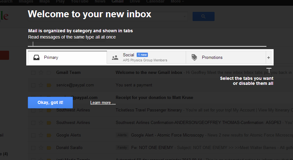
    But, I have become quite satisfied with my email workflow, and even something as innocuous as the tabs to organize email is disruptive to my work. This will drive me to move to using a MUA to process my mail (Apple Mail or Outlook) and to bypass the once excellent, spartan, and usable gmail interface.

    No, I will not give up my gmail address for this, but I would be a lot happier if you gave people the option to stay with what they had. You are getting as bad as Facebook in changing the look and feel of Gmail.

  • UX, an example of lousy design and usability

    While I am no longer in a realm that has to integrate with MFP (multi-function peripherals), I now use them more than ever.

    For the record, I am talking about the upper end HP office printer/scanner/facsimile machines.  The ones that integrate with an AD domain, and provide user based functionality.  So keep that in mind.

    First, the 1990’s want their processors and their displays back.  All of these devices run on a few different “engine” models.  All of them were originally designed in the early to mid 1990s (think RAM at $400 a megabyte).  The screen resolution is probably 50ppi – state of the art for LCD touch displays in 1998, and to add insult to injury, they are monochrome.  Ugh.  Ugly.

    The processor choice is important too.  The UI is largely event driven (I know this from my time in the realm of building connectors), and the processor has trouble keeping up even when a user is manually entering information.

    Second, the API’s are all littered with legacy calls and widgets.  This is tp provide backwards capability, so that a connector designed in 2002 has a fighting chance to still work, albeit as lousy as it did in 2002.  That this is a curse is not immediately obvious.  Who wouldn’t want to keep a wide range of legacy products alive?  But, it cripples what can be done.  Often connectors, and widgets are run slowly  on purpose to match the timing the device expects. … and this leads to users havng longish delays to respond to soft buttons pushed.  Which leads me to point 3

    Third, none of the major device makers has found a good tactile indication to signal to the user that their input was recognized.  If the user can’t see a state change, hear a “click” or feel a button change (a tactamorphic touchscreen, how cool would that be?), they are all to liable to “double push” the soft button, and then unintended consequences that often require a signtout/signin process again.  Groan.

    While I don’t expect the visual experience of Android or iOS, some significant improvements are needed. On a device that can cost $35,000 it seems like a reasonable expectation.